The colour of data
 I was speaking at the PSDayUK event in Birmingham recently, I had a good audience quite a few of them said nice things on twitter afterwards.
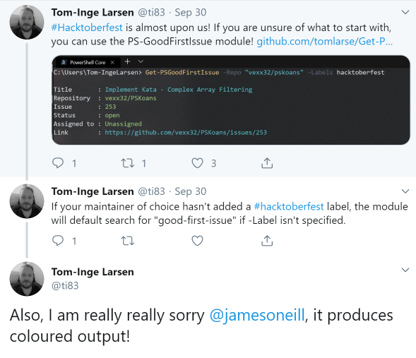
A couple of days this showed up in my feed.
Why is Tom apologizing ?
I was talking about writing code to be sharable and easily re-usable, and I had a slide headed
The Biggest need to rewrite …
- Scripts which are too concerned with printing output on screen
Write-Host –because coloured output is important.
I said something along the lines of If “What colour should it be” seems like an important question your focus is wrong. And I think I stressed that formatting should convey something. Why did I put the previous bit in bold? So that if you skim down the page important things jump out. We know instinctively, that Red output means error, and Orange means warning, we learn how editors colour code different parts of syntax and what initially feels a bit random soon makes sense. But what about the use of cyan and green text in the screen shot Tom posted? The link is not clickable in most places where PowerShell is hosted (it is in Visual Studio code), and the title definitely isn’t. Might the green sometimes turn red to indicate a problem? No, it’s always green. This is formatting at the whim of the author. I’m left looking for a deeper meaning that isn’t there, so in a sense this “prettiness” is making a less effective result. [Edit: After I first posted this (on wordpress) Steve Lee reminded me that some people may need to customize the colour of the error messages, so it is not completely safe to assume Red. Forcing text into a specific colour might make it unreadable for some users.]
Interestingly the author of code that Tom showed hadn’t gone down the rat-hole of using Write-Host. So this will work
$GFI =  Get-PSGoodFirstIssue
Start $GFI.html_url
This alone saves the need to rewrite to use the command in a way the author didn’t think of, which is a fairly big win. However that’s not quite the end of the story because
$GFI > temp.txt
Gives a text file like this
Title       : {esc}[96mPowerShell should… {esc}39[m
Repository  : {esc}[92mPowerShell/PowerShell{esc}39[m
Issue       : {esc}[92m2875{esc}39[m
Status      : {esc}[92mopen{esc}39[m
Assigned to : {esc}[92mUnassigned[{esc}39[m
Link        : {esc}[96mhttps://github.com/PowerShell/PowerShell/issues/2875{esc}39[m
The {esc}[ introduces a control sequence. 96m sets the foreground to bright cyan, and 92m sets it bright green and 39m sets it back to the default. How did that happen ?
In the function, a type is set on the data to be returned, like this
$issue.pstypenames.insert(0,"PSGFI.GithubIssue")and Type data is set up for this type with half a dozen lines like this one.
Update-TypeData -TypeName PSGFI.GithubIssue -MemberType ScriptProperty -MemberName "Title "
                 -Value {$this.Title -replace '.*',"`e[96m`$0`e[39m"} -Force
Notice that for the title property here, it creates a new title-with-a-trailing space property (That’s not a Typo in -MemberName “Title “).
And finally the script adds one more piece of type data to say what should be displayed by default, which includes that property
Update-TypeData -TypeName PSGFI.GithubIssue -DefaultDisplayPropertySet "Title ",
                                Repository, Issue, Status, "Assigned to", Link
The net effect of all of this is that the returned object is given 6 extra properties, and those properties are displayed by default.
If you want the original object and its properties, they are there, untouched. They are available for a Select-Object or Format-List command to get different output – much better than Write-Host.
Instead of adding the properties via TypeData, it’s possible to achieve the same effect on output using a format.ps1xml file, the result is the same: the default formatter outputs text with ANSI escape sequences embedded in it. The whole thing could be done using Format-List with custom properties and adding a –Raw option to output unformatted data, but the formatted version gives the same results when redirected and when saved to a variable this gives bad results.
 While I was drafting this, the preview of PowerShell 7 updated
 Select-String to have an emphasis option which is on by default, but can be turned off with –NoEmphasis. This conveys useful information – Select-String matches regular expressions, so finding the matching text by eyeball alone might be hard work. The default formatting for the [MatchInfo] objects that Select-String returns says “Call the object’s .ToString() method” and it is a change in .ToString() which applies the new formatting. The result is the same – objects with the right properties for the pipeline but escape sequences preserved if redirecting to a the file. Quickly putting > filename after a Select-String command isn’t a very common thing to do, the command-line switch works provided you remember to use it and those who frequently do it can use a format.ps1xml file or set a default for the parameter using
$PSDefaultParameterValues=@{"Select-String:NoEmphasis"=$true} to prevent it, so the file content issue should be over-stated.
My original advice was not to get too hung up on formatting, to use colour sparingly to add meaning (not to ‘pretty things up’) and never compromise on passing proper objects along the pipeline; and that advice remains. It doesn’t mean formatting is never beneficial, the preview Select-String shows it can be, but the benefit has side effects and the ideal is to allow people to turn it off. [Edit that ability to turn it off is can help avoid accessibility issues, and be very careful with dark colours on a dark background.]